
|
|
|
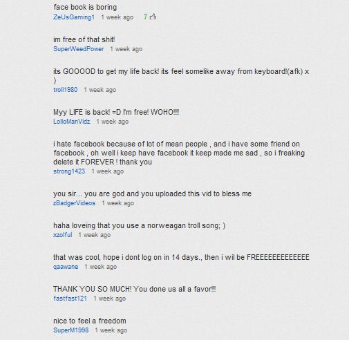
With considerable justified fanfare, Google has launched a major redesign of YouTube, that emphasizes user "channels" and social features, positioning the service to be an ever more formidable (and as far as I'm concerned, very welcome) competitor to traditional television. Much has been written elsewhere about these definitely positive changes. But there is one aspect of the redesign that caught my eye -- literally -- and had me initially scrambling to determine if I was suddenly having browser configuration problems or other browser-based issues. While it's common to think of YouTube mainly in terms of the videos themselves, there's a lot of text on YouTube as well. This includes various descriptive materials, comments, user video dashboard controls, and so on. For example, user comments on videos are an important social feature of YouTube. I read and moderate large numbers of them submitted every day on my own YouTube video uploads. So I was startled to see that the YouTube redesign has currently switched from a crisp, black on white design for most detailed texts, to an extremely low contrast black on gray (and for some pages gray on gray!) that frankly are a bona fide pain in the eyeballs for anyone with less than perfect vision, and that category includes vast numbers of us with naturally "aging" eyes that are an inescapable fact of life. Here is how the text now appears for a chunk of comments on my Deleting Your Facebook Account video. You can zoom up the text in standard browsers of course, and that helps a bit, but the lack of contrast is still a big problem, and much zooming tends to degrade from the overall page view experience on many Web pages in general. (As an aside, tiny fonts in smartphone apps that can't be easily enlarged are another constant struggle for many of us in these same cohorts!) To be sure, black on gray text in particular isn't always a problem, and it can be argued that backgrounds a bit darker than bright white may result in less eyestrain overall in various situations. I've used black on gray myself, but with relatively thick-stroke fonts. However, when the chosen fonts have relatively thin strokes as in the new YouTube case, the contrast goes south fast, and the result is something of a gift to opticians. User interface design is at least as much an art as a science, and Google doesn't make capricious changes. So I'm puzzled as to how this particular text display aspect was vetted, which seems to clearly (no pun intended) degrade from a primary functionality, at least for a significant percentage of users. I'm all for artistic embellishments in user interfaces -- when they don't interfere with the actual use of those interfaces themselves. As it stands, an overall wonderful new YouTube redesign has been made less comfortably accessible to many users, and that can't help but discourage its use. And that "looks" like an outcome that would be a real shame. --Lauren--
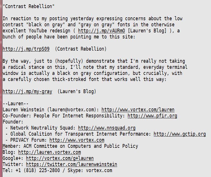
Update (December 3, 2011): : In reaction to the posting above, a bunch of people have pointed me at the Contrast Rebellion site, which is definitely worth a look. And just to (hopefully!) demonstrate that I'm not being dogmatic about this, I'll note that my standard, everyday terminal window is actually a black on gray configuration, but crucially, with a carefully chosen thick-stroked font that works well this way. |
Posted by Lauren at December 2, 2011 11:55 AM
| Permalink
Twitter: @laurenweinstein
Google+: Lauren Weinstein